
Let’s Talk About Color
We’re in the process of iterating the design direction of our Sigil Kickstarter. This article isn’t focused on that, but for those interested, these are the front runners.

When asking my sister her opinion on the above, we got on the topic of color more broadly, how it impacts emotion, and what that means for brands and our Sigil Kickstarter style-guide.
Color Psychology
There is a pretty deep field of study into color psychology. It is the idea that we have emotional responses to specific colors – an idea which is well supported by research.
Some of these associative relationships are culture specific, some are gender biased, and some hold true across time and place.
These are common associative colors in the United States – although obviously there is a lot more nuance and intermediate colors.

There is a deep rabbit hole you can go down on color psychology – with some surprising results – such as:
the color red has been found to influence sports performance… [in] bouts where the competitors were closely matched in ability… those wearing red won 60% of the bouts… [Wikipedia]
In Practice & Intuition
This is a pretty nice article looking at color psychology and branding. It breaks down major brands and what their color identity communicates to consumers.
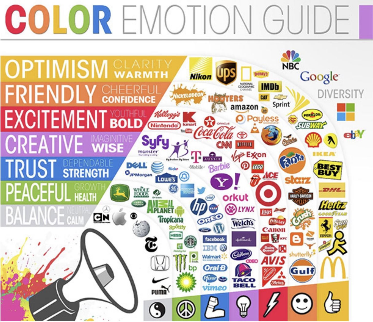
Graphic by The Logo Company
Obviously, a lot more goes into brand identity than just the color of a logo – but I found both the clustering of colors within an industry, as well as the outliers interesting. For instance, a lot of fast food brands have reds or yellows in their logo (Mac Donald’s, Subway, Chick fil a, Burger King, KFC, Pizza Hut, Dairy Queen, Wendy’s…) but then you have Taco Bell with blue and pink.

We spent a lot of time thinking through our brands (especially Sigil), and while I didn’t apply color psychology in any kind of systematic way, I did work with very skilled graphic designers (Christine Santana for Nut Hunt, and Mike Hnath for Sigil).

We were thoughtful around the emotional responses that we have to our imagery. The bright oranges of Nut Hunt convey a frenetic and fun energy, while Sigil is more mysterious and magical with its deep purples.
The takeaway for me isn’t that we need a high level of technical expertise on the academic literature on color psychology – rather that it is something that we should be conscious of, and where we should be reflective and trust our emotional responses and intuition.
Choosing a Pallet
This is an exercise that (not being a graphic designer) I hadn’t seen before but very much appreciate.
The authors took images with a strong emotional resonance and distilled them into their core color pallet.

They have a bunch of examples in the linked article. It’s amazing how much of the feel of the initial images are retained when they are distilled into 3-4 color blobs.
We don’t have a lot of opportunities to come up with new brands (I’m hoping to ramp Pine Island to two games a year eventually), but this is an approach that I will definitely keep in the back of my head when thinking through our future brand identities.
Which board games have your favorite or most resonant color pallets?